Subscribe to our newsletter
, I'd love to keep up with Espina Studio's updates, references, and what you're currently exploring. My e-mail is
The Challenge
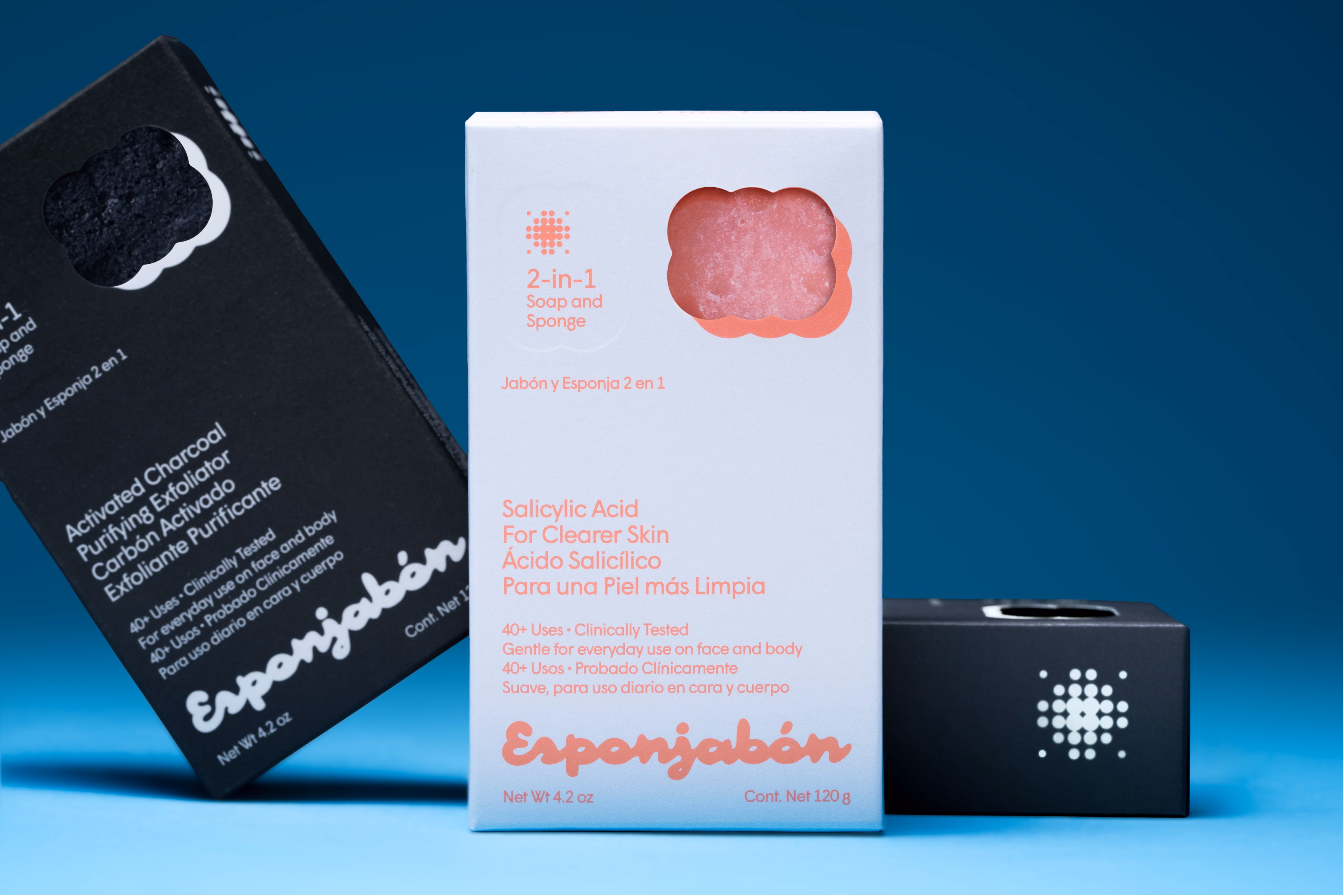
With more than 25 years as an established household name, Esponjabón has redefined the traditional sponge and is today a prime example of Mexican ingenuity. Known for its variety of soap-infused sponges, its simple design features a range of active ingredients that adapt to the needs of every consumer.
Through deep research and analysis, we developed a visual overhaul rooted in the brand’s essence of adaptability and individuality. Starting with the wordmark, we added our own twist to a bold and distinctive typeface that honors the original brand while adopting a friendlier approach. For the isotype, we leaned into abstraction, creating a symbol that reflects the product’s transformation over time and is instantly recognizable to its users. These elements remain ever-present across a wide array of combinations within the color palette, forming pairings that align with the active ingredients and, most importantly, stand out on shelves.
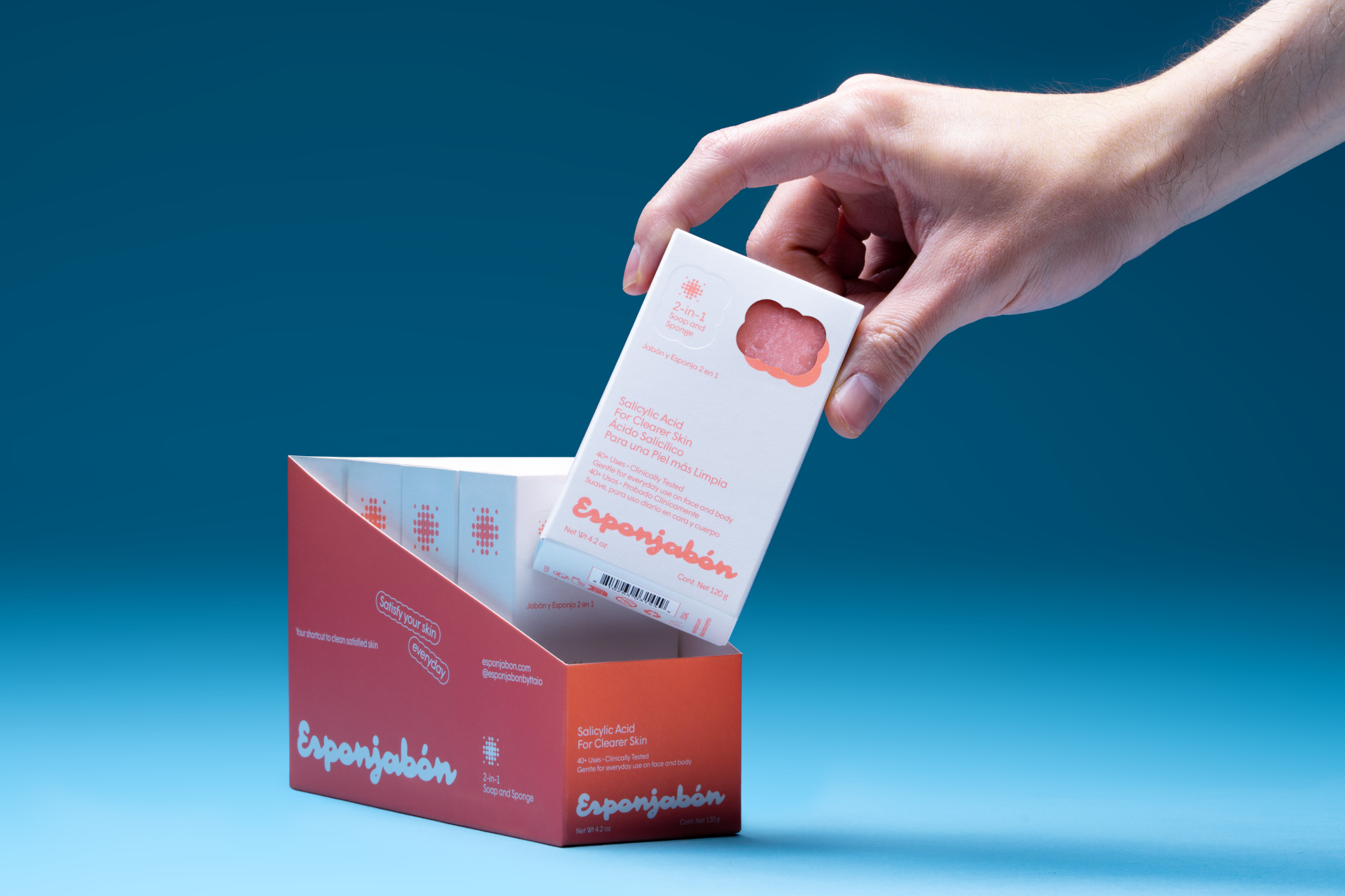
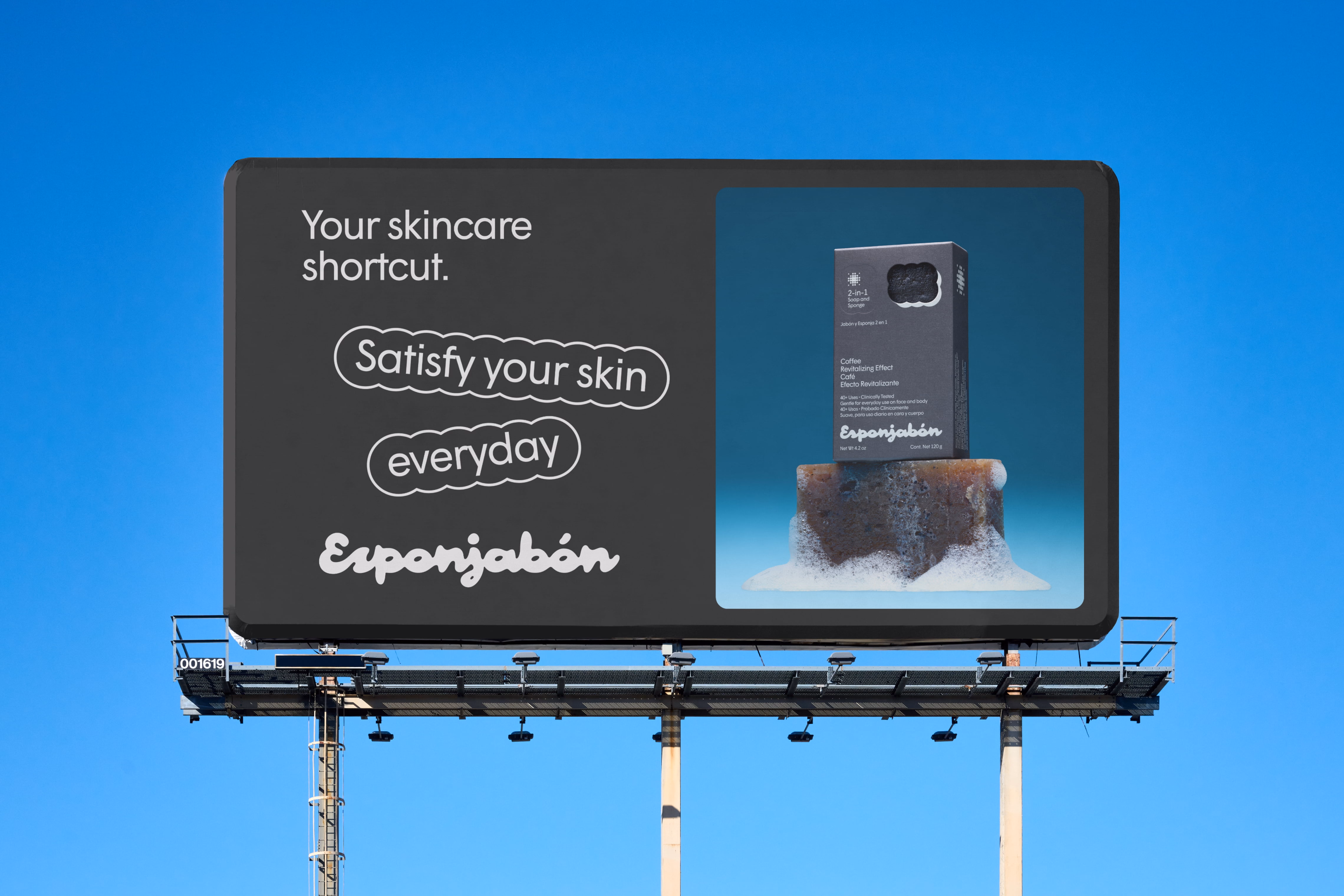
As Esponjabón begins its international launch across Europe and the U.S., the packaging was carefully developed with accessibility in mind, ensuring its functionality is always clear. The end result is a brand built around individual needs, accessible to everyone and unapologetically for the people.
Services
Strategy, Branding, Art Direction, Packaging
Team
Creative Director: Carolina Ortiz
Art Direction: Osvaldo Vázquez, Israel Herrera
Project Manager: Marysol Rubio
Concept & Strategy: Ángel Gómez, Alessandra Baragiotta, Ana Rosenzweig
Branding: Fernando Tellez, Maximiliano Cano, Estefania Morales, Aranza Grajeda
Portfolio: Pamela García
Clients
Emilio Smeke